Presidential Forecast Introduction & Methodology
By: Logan Phillips
Date: 6/27/2020
Joe Biden has long held a moderate advantage in the race against Donald Trump, but in the wake of the Coronavirus, the economic recession, and widespread protests over the murder of George Floyd and systemic racism across America, he emerges as the clear and decisive frontrunner about 140 days out from the election
Today, according to the Race to the White House Forecast, Joe Biden has about an 89% chance of beating Donald Trump in the Presidential Election. It is hard to express just how unusually strong Joe Biden’s position is for late-June - not only for a challenger taking on an incumbent, but for a presidential candidate, period. At comparable points during the year in the Race to the White House Forecast, the highest winning percentage any candidate has attained since 2000 was 64% - for Barack Obama in 2008. Even in 2016, when Donald Trump won an impressive comeback victory, there was no point in the election, at least in my forecast, that he would have had such a daunting outlook.
Forecast Projection for 2000-2016: 130 Days from Election & on Election Day

Now - let us be crystal clear: this election is far from over and Donald Trump absolutely can come back. The nature of the current political environment is unprecedented. At this point in the election, it is firmly a referendum on Donald Trump, who is an unpopular incumbent. However, Trump is beginning to unleash a torrent of negative advertising against Joe Biden and will attempt to tear down his reputation in order to make his candidacy more viable.
When you are viewing the model, think in terms of probability. An 80% chance of victory does not mean that Joe Biden has the election locked up - it means that Donald Trump is going to win one out of every five times. Look at it this way - my beloved New York Knicks were the worst team in the NBA in the last full season, winning 20.7% of their games. It was hardly an earth-shattering occurrence when they did win - unusual for sure, but it was bound to happen sometimes. The same is true here.

What does the pathway look like for Donald Trump? Over 65% of Donald Trump’s wins in my simulation happen without the popular vote. He can’t win while losing by 8-9%, but he can squeak out victories when he cuts Biden’s lead back to 1 to 3 points – winning with the same states in 2016, with potential in-roads into Nevada, Minnesota, & New Hampshire.
Biden’s Strength
Biden has three key advantages over Donald Trump. First, he is in a dominant position nationally - and this has been a strength against Donald Trump since he launched his bid for the Presidency back in April 2019. For the first six months of 2020, the lead stayed consistent, holding at around 6%. However, Donald Trump’s handling of the George Floyd protests has seriously hurt his standing, at least for the month of June. The clearing out of the peaceful protesters in Lafayette Square for an awkward photo op was particularly damaging – polls have shown that over 75% of voters have seen the images – and votes disapproved 63%-25% in a GBAO poll.
Additionally, while voters gave him a pass at the early stages for the historically unique challenge of facing America’s most dangerous pandemic in history, their patience is dwindling, especially for his discouragement of mask wearing and laissez faire attitude toward re-opening. My national polling average is intentionally designed to react gently to recent events - but the dip has been substantial and sustained over enough time that it now shows him losing 3% in June alone – trailing Biden by 9%.
Second, Biden has many routes to victory – especially compared to Hillary Clinton in 2016. He can afford to underperform in the Mid-West if he maintains his advantage in Florida & Arizona, and he can lose ground in Florida if he maintains his stronghold in states like North Carolina and Georgia. Donald Trump still has a mild advantage in the electoral college relative to his national numbers, but not to the degree that he had in 2016. It’s certainly possible Trump can win while losing the popular vote by 2%, but Biden would still be more likely than not to win under that circumstance.
Third, Trump’s approval ratings have been a consistent vulnerability for the President. State approval ratings can be quite predictive in projections – especially in years where an incumbent is running for President. Most re-election campaigns are at least in part a referendum on the sitting President. Trump’s average approval ratings for most of his presidency have been among the worst in American history on the national level since scientific polling began during the Truman administration – and he’s consistently underwater in most, but not all, major swing states.
The Forecast
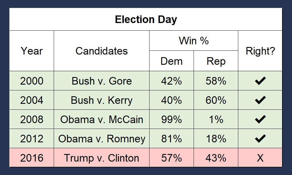
The Race to the White House Forecast projects the winner and margin of victory for every state and the likelihood of both candidates winning. It turns these state projections into an overall simulation of the Electoral College. Each day, the forecast runs 50,000 simulations of the Presidential Election, which are updated right on the site. Every feature of the forecast was informed by looking at historic models that have succeeded and failed in predicting elections – combined with my own hypotheses about politics. I tested every single piece of my model rigorously by running every presidential election since 2000 in all 50 states, Washington D.C., and the five congressional districts with an electoral vote. That is 280 elections combined.
Here is how the Forecast stacked up: By late May of each election cycle, my forecast successfully projects the winner of every state just shy of 92% of the time using only the data that would have been publicly available at the time. On election day itself, the forecast predicts the winner over 95% of the time and is within 3.78% of the result.
Read More: The Forecast is More Accurate in Re-Elections
The Forecast has proved most adept when a President is running for re-election. Earlier on, its almost twice as accurate - the projections are just off by 3% even 130 days out! How is this possible? I suspect the biggest reason is that voters are much more able to make an informed choice even in late June. They already know the incumbent President - and they have probably decided whether or not to support them for re-election. The difference in accuracy is less dramatic on election day, but still potent - in re-elections the Forecast got within 2.85% of the actual result on average, and predicted over 98% of states right. There was only enough state polling from 2004 and 2012 to be able to test this thoroughly, so feel free to take this with a grain of salt. However, the preliminary test I ran on earlier years backed up this assertion as well.

I break down how every piece of my model works in the sections below. If you want to understand how it works in more extensive detail, look for the “read more” boxes, where I will illustrate more of the specifics, and show some of the formulas that I used.
Finally, I know that many reading this on both sides of the aisle felt burned by the models in 2016, which often had too much confidence in Hillary Clinton’s chances of winning – with some showing her as high as 98%. I have made an extensive effort to learn the lessons of 2016 and avoid repeating the same mistakes – and I’ll explain exactly what my model does different in a section called “2016 – The Elephant in the Room”– which includes the results of how the 2020 Race to the WH Forecast does when I feed it the results from 2016.
The Margin of Victory
In my test of the Race to the WH model, I found that the best projection I could develop for the Margin of Victory was fairly straightforward – with three main legs of the projection that get the result within % even as early as June:
State Polling Average
President Trump’s State Approval Rating
Partisan Lean of the State, adjusted by the National Polls
In every state, the weight of each of these in the final project varies dramatically – and it will often change marginally week by week as we get closer to election day. To the chagrin of forecast modelers everywhere, some states never get any polls, so those states naturally have zero of their forecasts from State Polling Averages. Other states have many high-quality polls, and it makes up a bigger part of their projection.
On election day, the goal is to have polls as the primary component of the state projection. If a state has a high quality, high quantity, and very recent polling, then polling can comprise just under 87% of the score. Naturally, you only want to be so reliant on polls early in the cycle, - so as of June 19th, that cap is set at 48.5%. It will slowly rise over time to 87% on election day.

Loading...
I will break down exactly what each part is, why they matter, how they are calculated, and what their role is in the formula below. If you are ever skeptical about any of the projections you see here for any of the competitive states, then you will be happy to know that I provide the tools to assess the projection. All election long, I show exactly how each of the three parts feeds into the formula – with live updates almost every day. I even explain the unique characteristics and recent history of the state and how much they matter for each election. They are available right here.
State Polling
The most important portion of the Forecast is the state polling average - specifically, the margin that Biden & Trump lead by. This is quite important in June, but it is the heart and soul of the Forecast projection once we get to November. (You can check out the state polling average for every state here – with charts showing how the polling has changed as far back as October for each state, the total list of all polls in the state, and how much my model weighs them.)
Polling factors much more heavily in my projection for states that have higher quality polling. To measure this, I do not just take the number of polls. Why? There will always be states that have a decent amount of polling, but the quality of the pollsters is lacking. It could be four months old, and they may have interviewed only a few hundred people.
That data is certainly better than nothing, but it is not nearly as useful. Instead, every Poll Score - and the total combined Poll Scores for a state give us their State Poll Score. The higher the score, the higher the factor it is in the forecast.
I spent dozens of hours ensuring that the polling average for each state is as predictive as possible. Not all polls are created equal - and my polling average gives extra credence to the type of polls that have proven their accuracy. The average is based off their score. Let us say New Hampshire has two polls, and Poll 1 has a score of 150, and Poll 2 has a score of 50. Poll 1 will then make 75% of the average.
The initial Poll Score is made up of two main factors - Pollster Grades, and Sample Size.
Pollster Grades
Some pollsters have a much better record of projecting elections, while other pollsters tend to miss by a lot. Nate Silver’s FiveThirtyEight has done excellent work evaluating the pollsters with the best and worst predictive value, and they have kindly released that data to the public.
I used their assessments as a starting point, and developed poll rating for about 500 pollsters from 0 to 100. The most accurate pollster, Monmouth, has a 100, where others like Marist and the New York Times are right behind them.
Read More: Pollster Grades
In contrast to 538, I’ve decided to give a bit more credit to new pollsters that did a really good job in 2018, or pollsters like Data for Progress & Civiq that outperformed some real high quality pollsters in the Democratic primary - which are some of the toughest races to accurately predict. In the future, I will release the exact formula of my Pollster Ratings, which will include a list of every pollster with their grade and score. It is worth noting that there are a very small handful that get a score in the negatives with a particularly atrocious record - but they represent less than 4% of all pollsters.
Sample Score:
Second, polls get a Sample Score. The larger their sample size, or in other words the number of people that they polled, the better the score. Here is the catch though - the added value of a higher sample drops off significantly after a certain point. While there is a big difference from a poll of 100 versus 200 people, there is not nearly as big a difference between 2,000 and 2,100. My formula reflects that.
Read More: The Sample Score Formula
I created the formula so that an average sample of about 600 people would get 50 points. The maximum score a pollster can get in Sample Score Points is 250, which would have an enormous sample of 12,500. Here is the exact formula, where S=sample Sample Score Points = 50*(S/500)0.5
Now, I have the Initial Score, which a poll will keep for the entire election cycle. The final score is multiplied by both the Time Factor and the Version Factor. The Initial Score stays constant for the entire election cycle. To get the overall final Poll Score, the Initial Score is multiplied by both the Time Factor and the Version Factor
Time Factor:
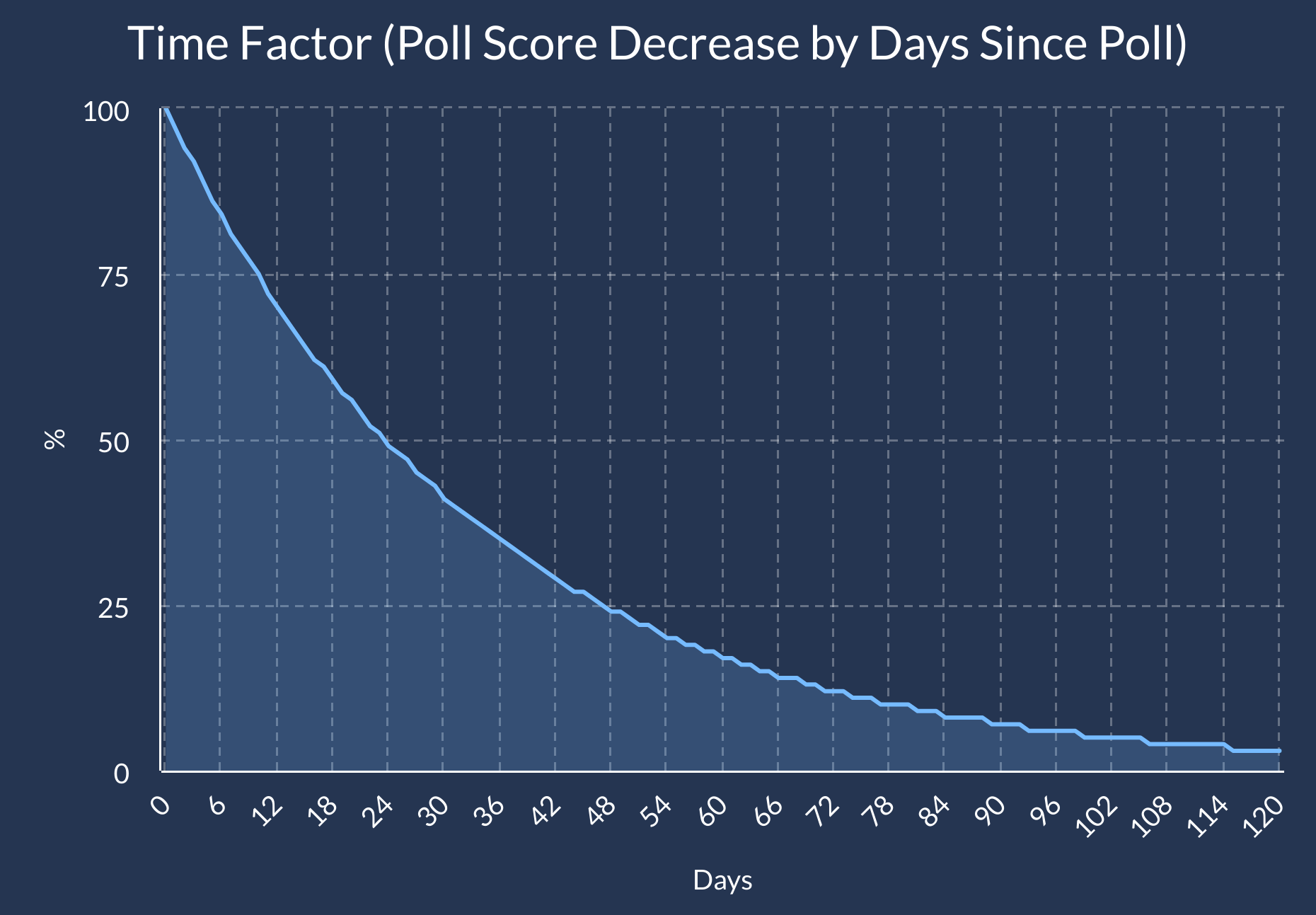
Polls are simply a snapshot of what voters felt during the time of the survey - so a poll conducted three months ago, or even a week ago, is not as useful as a poll administered the day before the election. Therefore, the Polling Average prefers polls that were conducted as recently as possible.
If you watch election related television coverage, you will notice that every day on the campaign trail is treated as if this event, this moment, could define the entire contours of the election. I will save you the suspense – chances are it will not, and some moments that feel transformative at the time can end up playing a very small factor. The Forecast polling averages are a lot less reactive then Real Clear Politics - which is more focused on showing a snapshot in time versus projecting the result of the election. However, once we approach election day, that shift could have a monumental impact, so the penalty is much sharper on election day than in June.
Read More: Calculating the Time Factor
The Time Factor starts at 100%, and declines quickly at first, but softens the further back it goes. A poll taken 100 days ago, and a poll taken 120 days ago are not that different in predictive value, while there is a massive difference from a poll released 10 days ago and one taken 30 days ago. The date assigned to the poll is midpoint between the day the survey started and the day it ends. If the total days of the interviews was an even number, we round up to the more recent date. Here is the exact formula:
P= Days Since Poll
E = Days Till Election
S = Scaling #
National Polls:
Scaling #= 14.1+E x 0.0630 0.868+(E x 0.0010)
Time Factor = 0.4 x (P/S)
State Polls: Time Factor = 0.5 x (P/S) S= 16+E x 0.05800.868+(Ex0.0010)
Version Factor
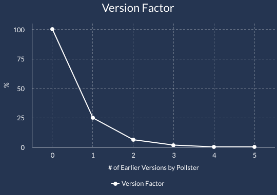
Without the Version Factor, one pollster having a bad election cycle could tank the entire model if it released daily polls that combined took up half the projection for a state. The version factor prevents this from happening - the newest poll by a pollster gets a version score of 100%, but all the remaining versions will get downgraded.
Of course, this only affects polls in the same location – a poll should hardly lose value in Michigan because the pollster has been active in Montana.
Poll Average
After each state has a poll score, the Forecast calculates each candidate’s polling average and corrects for the bias of each pollster. The extra section below breaks down exactly how this is done once each poll has their own poll score.
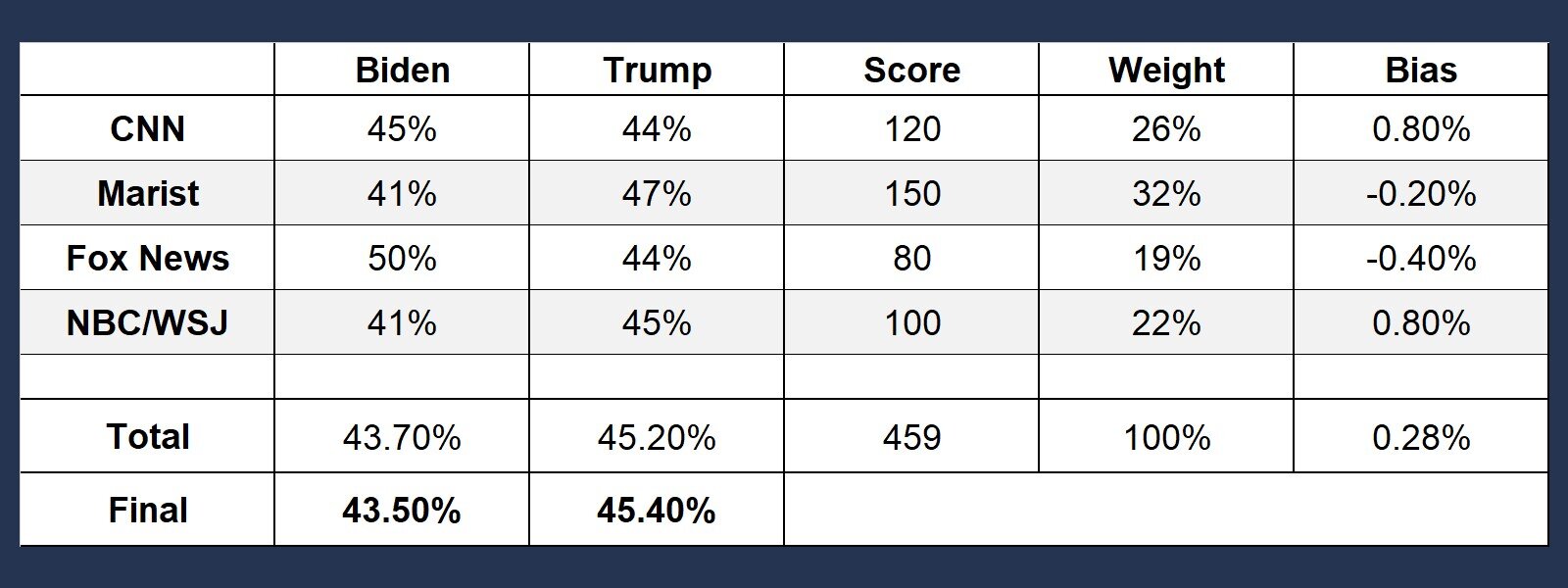
Read More: The Poll Average
First, the forecast adds all the polls scores together to calculate the total state score– which is 450. Next, each individual poll score is divided by the total, which gives the forecast their weight. Third, the forecast multiplies Biden’s percent in each poll by the polls weight and adds them together. The same is done for Trump - in this case 43.7% for Biden and 45.2% for Trump’s. The final step is to address the pollsters’ historical bias – which is imported from the pollster data released by Nate Silver’s FiveThirtyEight. The forecast multiplies the bias of each poll by their weight, and adds them together. The total bias here is 0.28%, suggesting a tiny bias in favor of Biden. Biden's total would therefore be adjusted down, and Trump's total would be adjusted up.
Approval Ratings
Political scientists have long noted that approval ratings for incumbent Presidents can have significant, though far from perfect, predictive value for national level elections. My hunch was that the same would be true for a President’s approval rating on a state by state level – and my testing of the past five election cycles bared this out to be true.
Polls and Partisan Lean are weighed more, but approval ratings improve the accuracy of the projection, especially the further away election day is. Accordingly, approval ratings have a larger weight earlier on in the cycle.
For states that are rarely polled, these approval ratings are extremely valuable on any point in the election – and can dramatically improve the accuracy of the projection. They also serve as great early indicators for states that could get competitive if one candidate starts to really break out ahead by a wide margin. Every cycle, there are usually at least 1 or two pollsters that look at approval ratings of the President in every state, so this is often one of the only election year data points for at least a dozen states.
In contrast, in states with lots of high-quality polling, the approval ratings impact on the forecast can drop down to as little as 0% once we get to election day – although they play a larger role early on.
Extra: Weight of Approval Ratings
A state with only one approval rating poll will have approval ratings make up an initial 2% of the formula. It gets 1% extra for every 4.5 points of poll score above 0, with a hard cap of 13.8%. That cap is lowered significantly based off how much state polling there is once we get closer to election day.
I am a strong believer that negative partisanship, or people voting because they dislike the other candidate, is quite predictive. Therefore, my model does not just use approval ratings by themselves, but Trump’s approval rating subtracted by his disapproval rating in that state.
Read More: Why isn’t Joe Biden’s Approval Rating Used?
I do not use Biden’s approval rating by state. Why? While I am certain that voters' impression of Biden factors into their vote, and by extension almost certain that Biden’s favorability rating would at least have some predictive value, I don’t have a way to properly test this on the level I would need to comfortably add it to my model. Significantly less pollsters have released approval ratings for non-incumbent candidates running on a state by state level, especially outside of 2016. Regardless, I am tracking Biden’s approval rating with all the polls that provide it in case I can find a responsible and credible way to use them in the future.
Partisan Lean
The last leg of the projection is the partisan lean for each state – or in other words, to what extent the state has voted for Democrats or Republicans in comparison to the rest of the nation. This is adjusted by the current lead in the national polling average that Biden or Trump has.
The partisan lean essentially grounds the entire projection. It changes less overtime, it is based in political history, and keeps the forecast from being overactive. In 2020 – it stops the Forecast from thinking Trump is on the verge of losing Arkansas when the only poll released there shows him up only by 4% - because the state has an initial partisan lean of about 30% Republican.
The Partisan Lean’s weight for each state is whatever remains when you subtract the poll and approval weight from 100%. As valuable as this piece is, some candidates over perform in some states more than others - and states partisan leans shift over time, sometimes in unexpected ways. Otherwise, we could just use partisan lean data from 1980. Therefore, if the state polls consistently show a different picture, then that will be weighed more. Given how much polling can change over time, the partisan lean is weighed much heavier early on - and today makes up 60% of the average state’s weight. The lowest it can get today is 38%, and on election day it will always be at minimum 13.5%.
Read More: Changing the Partisan Lean
The initial partisan lean is computed by calculating to what extent the voters in a state preferred Democrats or Republicans compared to the nation at large in the last two presidential elections, and the last midterm. Take Florida for example - it voted for Trump by 1.2%, even as Clinton won the national vote by 2.1%. For that year, the lean was 3.3% towards Republicans. Now, the Forecast’s Partisan Lean does not use only 2016 - this only makes up 68% of the score. 17% comes from 2012, and 15% from 2018. When these are factored in, Florida’s overall partisan lean comes out to 4.0% towards Republicans.
This is only the first part of the partisan lean score. We then adjust it by the national vote - which is calculated the exact same way as the state polls. If Biden has at least a 4% lead (or Donald Trump leads), the Partisan Lean component of the Forecast would have Trump winning Florida.
Determining the Win % for Each State
Once we have a projection for the margin of victory, the next goal is to determine how likely Biden & Trump are to win the state. We cannot do this with the projection alone - first we must determine the degree we can reasonably expect the actual result on election day to differ from the projection. This is the Standard Deviation.
Read More: Standard Deviation
68.2% of the time, the actual result should be within X points of the projection, where X here stands for the Standard Deviation.
This will vary greatly - across states, and over time. The error shrinks significantly as we approach election day, especially in the last few weeks. Be prepared to see the favorite for a state have their chances rise at the very end - barring of course a change in the race.
To determine the Standard Deviation, the Forecast starts with a Base Error for the entire country. Then, the error will be adjusted for each state. The states that we can be more confident about the projection for will have a lower error, and the states that we are not as sure about will have a higher error.
Base Error
The base error is the starting point for every state. It decreases as election day gets closer and increases the larger a candidate’s lead in the national polls gets, and increases the more volatile national polling has been in the last few weeks. Finally, the base error is lowered if the race features an incumbent running for re-election. For a more in-depth breakdown on how the base error works, and why the win% for each candidate could change significantly in the last few days of the election, read the Extra section.
Read More: Base Error
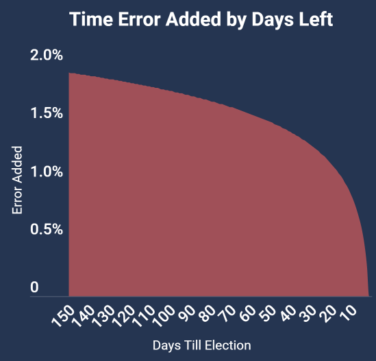
All things being equal, on election day, the base error is just over 5%. At this point in the cycle (late June), we add another 2% because we are still far from the election, so we need some extra uncertainty. On Election Day, the time specific error will drop down to 0. Now, and here is the important part: this does not decrease at the same rate every day. Even 10 days out of the election, it is at 0.8%. Why? Because Americans often change their mind, and one candidate’s lead can occasionally drop rather significantly in the last ten days.
Second, sometimes the national polling shoots up and down a few points every week with changes in the news cycle, and this can cause the projection to show some crooked numbers without any adjustments. Therefore, more error is added when the results have changed a lot in recent days to prevent this from happening.
Third, more error is added if the gap in national polling is high - as the misses tend to be a bit higher then - especially in the years before 2000. This affects the Forecast right now, as Biden has a big lead of close to 9% - and there is a very real chance that Trump will make the election more competitive.
Finally, the error is lowered by just under 0.5% when an incumbent is running for re-election. Why? The model has a good track record in all years, but it gets 98% of states right in re-elections. Voters already have informed opinions on the President early in the race, approval ratings are much more predictive, and more often than not these elections are referendums on the incumbent. The data actually suggests that the error should be about twice as big as I set it, but I decided to be modest because I don’t have enough data to test it on years before 2000 that I would need to have more confidence that the effect is that large.
State Error
The forecast error for each state can differ from the base error if we have evidence that the forecast should be more/less accurate than average. These are the six factors that come into play:
Polling and Approval Ratings: The higher the polling & approval score, (or in other words the quality/frequency of the polling in that state), the lower their error. If a state has no polls, then the model is essentially forced to make a projection with one hand tied behind its back, so an enormous 4% of error is added to the standard deviation
Consistency in the Projection: It is a big warning sign if the state polls and the partisan lean suggest wildly different things, and this raises the error significantly. If they suggest pretty similar results, then there is a good chance the forecast is right, so the error lowers. Right now, the state with the biggest flashing lights is Arkansas, where a poll shows Trump up by only 4% - by far the worst poll he has gotten all year in a state that he should win by at least twenty percent.
Undecided Voters: When there are a lot of undecided voters, there is a higher chance of one candidate can swing ahead on election day. In 2012, very few voters were undecided, so the Forecast would have given President Obama a much higher chance to win the states he was leading in as a result. In 2016, there were far more undecided voters, especially in the mid-west, which signaled an upset was quite feasible
Big Swings in the Projection: States that have undergone dramatic changes in the projection, usually due to surprising polling data, see their error rise until confirmed by further results. Florida had a rise here recently after Biden significantly expanded his lead in the past two weeks.
Partisan Lean: States that are highly polarized in one direction or another tend to have higher levels of error.
Congressional Districts: The last adjustment is for congressional districts in Maine and Nebraska, the two states that give 1 electoral vote to the winner of each district. They tend to have higher levels of error.
Finally, two more things to keep in mind. First, all these factors are modified rather significantly by how far we are from election day. The drop in error is much bigger for states with high quality polling once we get closer to election day. Even if we had a million polls for Arizona on June 1st, we still could only tell us so much, as voters could easily change their minds in the months to come.
Second, there is a cap and floor for how much the base score can be altered up & down. These caps also gradually expand as we get closer to election today, especially in the last three weeks.
Win %
With the projected margin of victory, the standard deviation for each state in hand, the Race to the White House Forecast can finally determine the Win % for each state. Accuracy here is important: When the forecast says a state should be won 60% of the time, an upset should genuinely happen 40% of the time.
During my many tests of the model in past elections, it’s generally a bit more conservative on the win % then the results say it should be. However, this is by design. Elections since 2000 have been more predictable and less conducive to big changes in poll swings than they have been historically. This is likely caused by a combination of better and more frequent polling, Americans becoming more partisan and less persuadable, and a bit of sheer luck.
I think it is best to be prudent here and assume that the latter two causes might not hold in future elections, or at least to a lesser degree. Maybe 2016 is the beginning of a trend. For that reason, I intentionally gave a decent amount of breathing room, and have set the standard deviation a bit higher than the data would suggest.
To determine the win %, I use something called a normal distribution. The normal distribution. takes three inputs: The Mean, the Standard Deviation, and X, and in return gives me the % chance a candidate has of winning. The Mean in this case is what I expect the average result to be - which in this context is the Projected Margin of Victory. Second, the Standard Deviation indicates how far off I expect the result to vary from the projection and is represented by the State Error. Finally, we have X, which in this case is 0%. When you are using a normal distribution, your trying to show how often the result will be higher or lower than x. In this case, of course, we want to see who will win the election. We are testing how often Democrats have a lead that is greater than 0% - when they do, Democrats win, when they do not, Republicans win.
The Simulator
Every day, I run the Race to the WH Forecast 50,000 times, and update the results here. Here’s how it works: The Forecast starts with the projections that are made for the state. In each simulation, states will vary from the projection with Republicans or Democrats winning more support than expected.
Let’s say that Biden is expected to win Wisconsin by 2%, but the simulation shows it being 3% more Republican than expected. Trump would win in this simulation by 1%.
Essentially, the simulation runs a normal distribution 56 times (50 states, 5 congressional districts + D.C.) for every simulation, 50,000 times per day. It needs three inputs. The first two should be familiar from earlier - they are the Mean and Standard Deviation - or the Projected Margin of Victory and the State Error. The third, Probability, is new.
Essentially, the Probability represents the total range of outcomes that can happen in the simulation. A score just over 0 (like 0.01%) would be the best-case scenario for Donald Trump, while a score just under 1 (like 99.99%) would be the best-case scenario for Joe Biden. This is the part that makes it a simulation. Every state, in every simulation, will have a different number. How do we do this? By using something called random numbers, which randomly choose anything from 0.01%, to 99.99%
The thing is, each state doesn’t just get one random number. That would lead to a disastrously inaccurate model - because it would treat each state like an island. That’s how you get crooked numbers showing the favored candidate winning something like 98% of the time. If Biden or Trump overperforms the current projections, the chances are high this is not specific to one state. A fairly intricate combination of three main categories give each state their probability number.
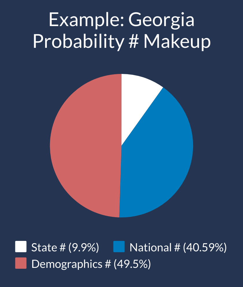
State Probability #: This is the easy part. Each State & D.C. has their own random number that is unique to them - with the exceptional of the Congressional Districts of Maine and Nebraska, which share their number with the parent state
National Probability #: This # is the only one shared universally by every state. Think about it as a simulation of the popular vote. If Biden underperforms by 3% compared to the national polls, Trump on average will do about 3% better.
Demographic Probability #: America is a huge and diverse country, with massive variations across states in race, religion, and education alone. So, while there is big national component to these elections, states with certain type of characteristics tend to move together
Let’s keep it simple - Donald Trump’s upset in 2016 was largely a result of strong performance in the Midwestern Trio of Michigan, Wisconsin, and Pennsylvania. These states have a lot in common! They have similar education rates, similar % of rural voters, evangelicals, incomes, and they are all from the Mid-West. Feel free to skip ahead to the next section this is enough info for you, but for those who are interested, read the Extra section to learn how it works. -
Read More: Demographic #
Currently, there are six parts of the demographic errors, though there may be more included in the future. The probability numbers of each group are averaged together. I tried to include a broad number because you never know what will affect the election the most, but I weighed some with historically higher levels of impact a bit more than others.
- Region (25%)
- Education (18.75%)
- Race (18.75%)
- Income (12.5%)
- Locality (12.5%)
- Evangelical (12.5%)
Region is the most straight forward - I divided the nation into nine areas, and each state falls into one. The others are more complicated. Let’s use localities as an example - which is the percent of voters in the state that are from Urban, Suburban, and Rural areas. Every simulation there is an urban random #, a suburban random #, and rural random #. We average the three together, based off the percent of voters from each area in the state.
Let’s use Iowa as an example - and let’s say the random numbers are 0.2 for Urban, 0.5 for Suburban, and 0.4 for Rural. Iowa is 28% Urban, 33% Suburban, and 39% rural. We’d get their Probability # for Locality by calculating: (0.2 28%) + (33% 0.5) + (39% * 0.4), which would give us 0.337, a pretty good result for Trump that would win him Iowa by 2%. Essentially, we undergo a similar process based off racial demographics, education rates, etc. for each state.
Putting it All Together
Finally, we must put the State, National, and Demographic Probability #s together. The weight, that varies from state to state, but, you can more or less expect about on election day for about 40% of the Probability # to be National, 38% to be Demographic, and 22% to be State.
Read More: Ensuring the Probability # is Dispersed
By this point, the probability # has been averaged so many times together that they tend to be much closer to 50% then they should be. This is a dangerous flaw - and without fixing it, Trump would only win states 3 to 4 % of the time that he was supposed to win 10% of the time (and the same for Biden). I correct this by boosting a certain percent of the numbers with probability #s over 50, and contracting a certain percent of probability #s under 50. I choose the numbers entirely by random numbers as well, so the simulation is autonomous.
The downside is that this hypothetically could lower the correlation of states – but I check this daily to ensure that similar states results align strongly together
The Simulator checks to see which states “voted” for Republicans and Democrats and assigns the win to the party with 270+ electoral votes, or a tie if they both have 269.My forecast runs 250 simulations at a time. I do this 200 times each day to get the 50k results. Then, the results are synthesized to determine how often each candidate wins, what their average electoral vote win are, and which states were most pivotal to victory.
2016 - the Elephant in the Room
Unless you spent all of 2016 in a cave, you may have heard that Hillary Clinton was looking pretty good on election day. For folks on both sides of the aisle, the pain or triumph of that election night has left many with extreme skepticism of polls and models like mine that use them to make a projection. To those who feel this way, I can understand your skepticism – and I encourage everyone to have a fair dose of skepticism whenever people try to predict politics.
Models, no matter how well-crafted, are not a cure-all. They struggle to detect factors that aren’t quantifiable, and they can miss out on the heart and soul of politics that can drive movements and transform nations. More often than not, these things will eventually show up in the numbers, but I’d wager the naked eye could have recognized that Barack Obama, Ronald Reagan, and JFK had a once in a generation type of political talent long before the data ever would.
However, models are still an incredibly valuable tool. If they are well made, they can do better at assessing the larger playing field than the naked eye, and they spot unexpected trends. They do a really good job of contextualizing things, which is quite valuable in a political system as convoluted as ours, with 538 electoral votes disproportionately delivered across 50 diverse states to the winner of each mini election.
They also cut through the perils of conventional wisdom. I can remember hearing dozens of times in 2007 that America was too racist to elect a black president. No one thought Rick Santorum was going to win the primary in Iowa until less than a few days before in 2012. And we all know how many said Donald Trump was never going to win the primary. A good model would have shown Barack Obama was the clear front runner in the general election by start of October, and it would have shown Donald Trump as the strong primary favorite in most states.
It also would have seen that Biden was far from out of the primary cycle – that he was likely to get second in Nevada, that he was going to dominate in South Carolina, and that he was fast moving towards a shockingly great Super Tuesday and would emerge out of it as the frontrunner. I know from personal experience - I built a primary model that did all three of these things.

One of my goals is to be able to anticipate when an upset is more likely to happen. As you can see above, the forecast would have shown Trump’s chances of an upset being significantly higher than most of the most popular models in that election cycle. To be fair to the organizations & individuals that crafted their models, it is obviously a lot easier to project an election retrospectively then live as it happening. The takeaway here is that my forecast has been designed to learn from President Trump’s 2016 upset, to be better prepared to predict upsets that might occur in the future.
First, the individual states in my model do not exist in a vacuum –the results are highly correlated. This is true on a national level, but it is also true on a demographic model. If he overperforms in one Midwest state like Michigan – then he will likely overperform in other midwestern states like Pennsylvania and Wisconsin. The same is true across race, education, and several other areas.
Second, Donald Trump’s poll numbers plummeted just a few weeks before the election after the “Grab them by the Pussy” tape was leaked – and this is a huge part of the reason why the win percentages for Donald Trump were so low in many of the models. Almost all models add uncertainty the further away you are from election day. My model uses a logarithmic based formula, where the uncertainty added due to time only reduces at a slow rate until about the last ten days or show, where it plummets to zero with one day left. As a result, even if one candidate has a clear lead for months on end, their chances of winning will only get so high until the last few days of the election. Voters sometimes change their mind in the last week of the election - which is exactly what happened in several states in 2016.
Third, 2016 had a particularly high number of undecided and third party voters in in both the state & national polls. This is a big flashing light that shows there is some real uncertainty here, and the polls could potentially break hard one way or another. As late as October 18th, 20% of Michigan voters said they were undecided - and high numbers in Wisconsin and Pennsylvania said the same. Accordingly, the uncertainty was higher in both states.
Fourth, the Forecast polling average is slower than most to adjust to huge movements in the polls, but it gets substantially more aggressive in the final two weeks. Therefore, it would have been able to adjust to the change in poll data that showed Trump was quickly narrowing his lead.
Fifth, Clinton gained from an enormous shift in the polls - one that never really had time to stabilize before it went back down just a few days later. My model would have added extra error due to the volatility in the national polls. At the height of Clinton’s lead, the volatility safe guard would have increased the chances of a Trump upset by at least 2% alone.
Sixth, big leads are traditionally less likely to be sustained at their current level, and the polling is more likely to either grow or reduce then stay steady. This would have added extra base error.
I’m trying to be as transparent as possible - and I’ll be laying out how the model was built in greater detail as we get closer to Election Day. In the meantime, you can see exactly how I calculated the results for every single state - and it will update every day as new polls are released.
Finally, when you are reading the model, remember to think in terms of probability. Don’t take an 80%+ chance granted – it’s far from a guaranteed victory. Given the sharp contrast in visions offered by both candidates this cycle, the last thing you want to do is sit this cycle out and realize your preferred candidate was narrowly defeated because people like you stayed on the sidelines. If Donald Trump starts to tighten his deficit in the coming months, then his chances will rise. Likewise, if he continues to trail by as much or more than he does today, his chances will diminish the closer we get to Election Day.